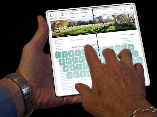
I haven’t needed one of these guys in a long time. I’ll have the layered version as a download on the old lion page within the next few days.
no screaming this time, just a big stick
I haven’t needed one of these guys in a long time. I’ll have the layered version as a download on the old lion page within the next few days.
One of the work related newsletters that I still subscribe to pointed me to a new web page for a group that I’m familiar with. We are completely unaffiliated, but their mission is still a part of me. I checked out the site and it’s very professional. It’s an attractive WordPress layout incorporating web fonts and the best of responsive design. I’m sure that if I ran it through a validator it would do as well as wordpress allows. It would do equally well on WebAIM’s WAVE.
It’s exciting seeing new work like this, since it wasn’t always this way. Refreshing, actually. Now the site looks as professional, and professionally done, as some of the top web sites I visit. In fact, it’s so well done, it could stand in for many of them. It has the same DNA as most, with only a few hints at sterility.
I no longer am involved with their people or their business, and I have no particular right to an opinion. I do feel strongly, though, about Penn State. I still feel connected to the community. I think that comes from the fact that it has a small town college feel about it regardless of its enormous budget and international reach. It has alway maintained a strong local character. It’s the future in your own back yard. Everything about it is recognizable as family. It makes me sad to see traditional family bonds break with new generations. Maybe that’s something I need to get used to.
When I was employed, or at least for the first 10 years of my employment, I advocated strongly for the use of local images, local illustrations, and local talent. All of these local things help to establish those traditional family bonds: the things that identify us and speak to the richness and quality of a personal experience. And that personal experience is a lot of why someone might want to engage with Penn State. Along with advocating for that local feel, I tried to dissuade colleagues from clip-art and stock photography. The image on this groups page is gorgeous …and it’s stock photography- shot in the Shenzhen Library in China. Is it obvious? Likely not to the regular viewer, but to me? Clearly; nothing about it says Penn State. If the designer had found the picture and used it as a way of giving art direction to a student photographer, it would have served a wonderful purpose: A photo of a happy Penn State student using digital resources at the Pattee Paterno Library. Or the Blissell Library at New Ken. Or the Lartz Library at Shenango. Or the Montague Law Library. Mont Alto’s Library. The Alumni Library. The Engineering Library. Special Collections.
Perhaps several of the universities in the Big Ten will use this same image? That way it might take on a family feel. Unless the PacTen uses it, too. And Albright. And Bloomsburg. And La Salle. And Kutztown.
Currently skinned out and laying on my work table.
This is my cell phone: a Nokia 6015i. It was the first cell phone I ever had. Actually the only cell phone I’ve ever had. I got it so I could have a phone with me in case my daughter, who was in boot camp at the time, would have an unscheduled moment to call her dad. Otherwise, I’d be phone-less.
It gives me no joy. Using it is torture. The buttons, which if I used it regularly would be findable with muscle memory, are almost bare, and I struggle to figure out what each is. Most transactions that I’ve tried to use my phone for start by having me enter my ten digit phone number. I’ve never been able to make it. Let me add that sometimes the buttons take two or three presses to register a numeral. Other times they register twice in the blink of an eye.
So using it for my convenience just doesn’t happen. Everything else? I picture people with little electronic buttons and devious smiles. They know they can press the buttons and make obnoxious noises in the person of their choosing’s close proximity to the point that the individual absolutely must deal with the noise. I can’t do that to someone. I don’t like it when anyone does it to me. For that reason, my phone is usually out of the way somewhere. Lost in an odd coat pocket, a drawer, maybe bumping around on the floor of my car. At least, when I realize it’s been missing for a few days, those are the places I look first.
On rare occasions when I find it, and remember to press a button to light it up, I get a message that says I missed a message. Often times I miss that message for days, and only see the message that I’ve missed a message when the phone lights up to tell me it needs to be charged. Then I get to try to recover the message that I missed. Often that takes three or four tries, then I get to listen to many of my older messages before hearing the new one. Every now and then I’m able to delete a message. I’d really rather not have to.

This is becoming a pretty big failure. I like this character a little more, but over all, I’m not liking the project. Maybe it’s the weather. I’ll shelve it for a while. Frustrating as hell.
Late edit. I’m done. At least she’s smiling.

I’ve been plotting this out and knocking around the beginning for a few weeks. I really need a sense of how it’s going to look when we got into the thing, so I worked up two spreads from the middle as a trial. Maybe I’ll work out in both directions? I’m not sure about any of it, but I think the style succeeds in being more contemporary than the pen and ink sketches. We’ll see. I want to include the drawings from the old guy’s sketchbook: Maybe it should be an additional volume included in a pocket somehow? I like the idea of integrating the old drawings with the text.
Seeing the spreads here is a big help. It needs work.
A grandchild. Early stages. I’m excited.
I get into State College very rarely anymore, but when I do I like to pair what ever it is I’m doing in town with something interesting on Penn State’s University Park campus. During my last visit I walked to Pattee, caught Chris Ware and a display in Special Collections, and noted a large number of temporary small signs and very oversized banners that bear the slogan “Penn State Lives Here.” It carried no significance for me. It was a bit empty and generic, but I thought at the time that, even though I feel that way, maybe students just starting will see it for four years, and it will represent their experience at Penn State to them, not me. Okay, I guess. It certainly puts some distance between me and Penn State, though.
Then, posting to twitter, Onward State shared a pointer to a CDT opinion piece by Jay Paterno where Jay railed a bit about the new slogan. I read the piece and had to agree- and I don’t always agree with Jay. Maybe my gut reaction wasn’t so far off of other people’s impressions?
Well over a year ago I sat in a meeting in one of the large rooms at the Nittany Lion Inn. The Penn State Marketing folks were doing a presentation on new directions. These were folks who had worked for Penn State for years—not a group of high priced marketing folks from outside. The message, though, wasn’t ours. The message was what the outsiders had come up with. “Penn State Lives Here” wasn’t any where near a part of what we heard, but maybe it was in the background. What we were told was that we all needed to be delivering the same message. They felt that the slogan, “We Are Penn State” sounded arrogant. It was the first time I’d ever gone to one of these meetings, and it was my last. At the time I wrote a very brief blog post about the event:
“We are Penn State” is arrogant? No. Sorry. Not when we say it. You just sound too much like you want to be Penn State without our input
It had no comments, as most of my more political posts went untouched. I received a response from a high level administrator:
Felt the same way. “we are all brand ambassadors” was a quote that made my skin crawl. Good thing that happened at the end.
It was good to hear support from such quarters. I had verbal support from others, too. I think Penn State paid a lot of money to have someone who knows what to do come in and fix things. I also think that no one wants to tell those outsiders they’re wrong because it means the money was poorly spent, a decision poorly made. But folks? It’s so apparent that it’s not from Penn State: Penn State is so much better than that.
Holidays are a great time for reflection. This holiday happens to be on, or very nearly on, the celebratory occasion of me wrapping up my first year of being employed by me—so my reflection has a harder edged, more assessing sort of purpose. As the boss, I need to see more effort from my staff. There’s been too much time wasted on reading and movies, time spent needlessly on whining, and an abundance of time spent drinking.
At the end of the year, very little time seems to have been spent on the tasks at hand: creating and learning. As an employee, I need to be glad that I’ve luckily had a few things pointed out by a friend. Over the past year I’ve completely relocated where I work and live, physically and digitally. I’ve totally changed my life style. This has to be seen as an accomplishment. I know that I’ve whined about my circumstance, maybe to my own detriment, and stopping that will make a good short term goal. The creative mental effort, too, behind the small amount of physical work that I’ve done has to stand for progress.
That small amount of physical work… may I share that here? First, as I cast about for a new place to live, I was almost certain I’d move to Millheim.
Walking around that area and sketching in the coffee shop let me formulate a story about mice. As that coalesced, the way I shared it and the ways it could be used gathered solidity, too. The entire project still feels right, though not living in Millheim there are only eight drawings finished. Moving to Bellefonte slowed the Millheim story, but walking and sketching in the new town suggested new pictures, new ideas, a new story- or concept. It’s still hard to say. I have over two dozen sketches of Bellefonte’s beautiful architecture with the whimsical balloon travel it suggests. From these sketches several stories grow. 
A drawing, done in Flash from sketches, was done as a coloring book submission, and it demonstrated a different style as well as an opportunity for a new coloring technique. That image was rejected by the coloring book people
but another sketch, done to illustrate a very bizarre set of circumstances, was accepted and printed in a beautiful British magazine. “carried with him a beautiful funigutts?” I think I pulled that off fairly well with a cute belly shaped creature that resembled the beloved Brittany… Too bad friends thought it looked like a beach scene. And too bad she was right.
I’ve enjoyed drawing in Flash since beginning with Macromedia’s Flash v.3. It responds well to a wacom tablet, and I think a bit of joy is discernible in the number of small spots created for a six minute, pro-bono biology animation. Too bad the work couldn’t be paid work, but in the end it was satisfying to do and at least a little helpful to my old work group. The work helped me to understand how much I enjoyed working in education- and for that clear insight, the labor was worth all of my effort.
My copy of the Flash application was launched for the first time since loading the CS6 Master Suite. I took the time to familiarize myself again with the animation environment. After I saw the results several friends had using a tablet app to “Simpsonize” their avatars, I tried it myself. I Simsonized me and a young friend, and lip-synced both characters. It worked out well enough and was a good, fun learning project. 
Very recently I had the opportunity to work with a friend’s text and rough out a series of illustrations for a children’s picture book. So far it’s just blocked in movement suggesting finished work. It provides a solid ‘tangible’ so others can discuss concrete issues affecting the way the work may or may not progress. Even though all of it is only sketched into a trial layout, some of the work was satisfying as illustration. Working with a complete text meshes well with the path I’ve already started to a mouse in Millheim and balloons of Bellefonte. The difference is that the story is someone else’s, and the art of it includes understanding, capturing, and maybe trying to enhance someone else’s vision. I think I show some decent work there, over all. And over the last year in general. 
As the boss, I will concede that it’s good to take time to smell the flowers, to read something suggested by a friend, to sit and reflect by the stream. There has to be a limit, though. Starting a new domain, with a new blog, is a few mouse clicks at most. Who are we kidding if we try to spin the past year as focused and productive? Even though we aren’t making any money yet, we are not a non-profit. The coming year needs to show some dedication and real personal development. No excuses; we aren’t believing them anymore.
After I rendered the drawing of Bellefonte as a coloring book page, I tried coloring it myself with flat tones just as an experiment. I thought it worked well and I liked the effect. As I work on the Millheim Mouse cartoons, I save versions of each of them as coloring book pages, too. Since I already had some available, I tried coloring one the same way that I colored the Bellefonte drawing. It’s monochromatic- one hue with a range of different values adjusted independently of the hue. I like the way it came out.