loss

An old friend passed in the Spring. At the memorial service his sister told me the last couple of years had been hard. Tim hadn’t really been himself: Heart trouble, lung problems, hearing difficulty. Still, I wish I could have seen him.

Tim was several years younger than me. We were room mates for a while and had a good friendship despite the slight age difference. Even years after we’d moved on, I’d catch Tim at the bus stop in town. When he saw me, he’d remove his ear buds, push up his glasses and say, “Hey, hi Dave! How’s Nancy?” Even years after my divorce. Some memories are hard to erase, I guess. Over ten minutes or so I’d find out about Tim’s family, his job, his plans, then his bus would come, his earbuds went back in place, and he’d leave.

When we shared an apartment, maybe 30 years earlier, Tim had a few odd speech patterns. I knew what he meant, but they were like colloquialisms specific to us. I tried to change some of them. Two in particular stemmed from his childhood: He still said “bus-ketty” when he meant spaghetti and “keck-ups” when he meant ketchup. Every time Tim used one of his mispronunciations I stopped him and asked him to say it correctly. Tedious and annoying perhaps, but at least I never did it in public.

It was easy for either of us to get burnt out over such things. One evening, I was at the dining room table reading and Tim was packing his lunch. His staple was a baloney sandwich with ketchup. (Don’t knock it.) As I read, I heard Tim muttering to himself and at one point he clearly said, “whoops, I need the keck-ups.” So we were alone, it was quiet, and I prompted him, “Hey Tim, how do you say that?”

Tim stopped and looked like he was giving it some thought. Then a smile bloomed on his face, he looked right at me and with exaggerated enunciation said, “Spaaa- getty.”

I totally lost it. We both ended up backs against a wall, sliding down to the floor laughing like crazy, tears running down our cheeks. Every time one of us caught his breathe the other busted him up again. I can’t remember if the sandwiches got made or not. I do remember the laughter, Tim’s face covered in tears. It’s such a clear picture. Like the one I have of Tim and I at my wedding. What a time.

Technically, I guess that all the heart problems, the breathing problems, the ear problems would be grouped and called the usual complications of Downs Syndrome. Whatever. He was a good friend. Every time I pass the bus stop, I still glance over hoping to see him on the wall.
Clarity

From November 27, 2012; my last written post for Penn State. Three days later I was gone. The blogs at Penn State go away tomorrow, and if it all disappears, this is one I want to save.

Over the holiday I enjoyed several days of standing in the kitchen both cooking and preparing to cook. Everything in place. I was determined to be organized, approaching each task calmly and efficiently. Keller’s kitchen is apparently like that: Each task begins with a clean work station. Use a cutting board once, then clean it and your knife so they’re pristine for the next task. Each step of a process is done perfectly: a perfectly cut brunoise, an undisturbed boil, just the right amount of seasoning. It’s respect. It honors the people who grew the vegetables, picked the vegetables, packaged, shipped and sold the vegetables. It honors the plants and animals themselves, and it honors the craft.

For the most part it worked out well. There were a few minor mishaps over three days, but I came away satisfied and more experienced.

One dish that I did was traditional glazed carrots. I needed to have a long shape on the plate to balance asparagus, so I trimmed a couple pounds of whole carrots into small, evenly shaped fingerlings. The classic method cooks carrots in stock till the stock is thick and reduced. For the stock, I started by making a “perfect” mirepoix and roasting chicken backs with it. At the end of the first day I had a quart of very nice, dark chicken stock. The second day I defatted the stock and brought it almost to a simmer with carrot shavings and egg whites. After the second day I had a couple cups of stock that tasted like an essence of roasted chicken, but was sparklingly clear. I didn’t need all of it, so I poured a few ounces into a wine glass that was sitting on my counter. It was beautiful. The color of iced tea, but not at all cloudy, with no sediment at all. It caught the light just like the crystal around it.

Did it matter? To me certainly. To the dish- I’m sure it was important though I doubt many would notice or care. It was clean and attractive on the plate, but after simmering with carrots, brown sugar, butter and cracked pepper probably no one could tell that it had been crystal clear. It just worked as intended, and tasted good, too. And I’ll do it the same way next time.

blog salvage

A few days ago I received another notice from “no-reply” at Penn State reminding me of the quickly approaching deadline for the end of supported MoveableType blogs at Penn State. I’ve received many, and when I was concerned I emailed friends who assured me that the files in my PASS would not be rewritten or destroyed on that date.

Phew!Right? But this email said specifically that the blog files will be a collection of files at this point and will no longer function as a blog or website. Not a website? How is that possible? I asked. Several times. But right here is says it very clearly: the files in my PASS that I’ve checked and accepted as well formed HTML on several occasions these past couple months would get turned into non-functioning files of some sort.

The contact link provided in the email didn’t work but there was a suggestion to first join, then post to yammer. That worked and returned again the assuranceYour blog files will be just a collection of files and will no longer function as a blog or website. that the files wouldn’t change, they’d still be functional html, but css may get messed in the process so no one could guarantee that the web pages would look the same.

So again, “Phew!”

It’s possible that the folks behind “sites at penn state” or even just the email writers are a bit over-zealous in their effort to close moveable type and see WordPress at “sites” be a tremendous success. Meanwhile, faculty who have important blog posts in untended blogs that are several years old, with commenting turned off, need their content to be read and linked to in journals and across the web and may be concerned. They do not have to migrate to a new blog. Certainly they may, and in fact will need to if they need the commenting and response capabilities of a blog. But if a post just serves as a static web page? Why bother?

The pages look like they do in your blog because of styles that may be imported styles from outside your PASS. That’s very easy to fix if you have any familiarity with accessing your html files. For the sake of this help article, I’ll assume you have a MoveableType blog in your PASS and can use the PASS Explorer to access your files.

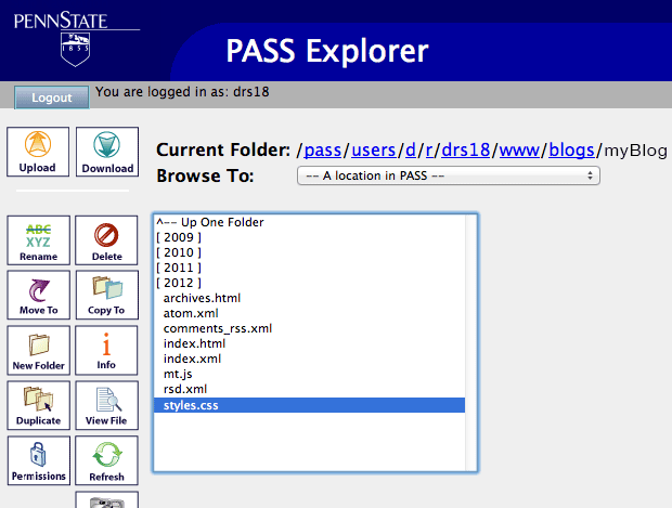
Styles dot c s s highlighted in a blog directory.

If you log in to your web space with PASS Explorer, you’ll see the “www” directory in the first screen. Double-click that, and in the next screen, scroll till you find a directory named “blogs” and double-click that. Inside that directory will be separate folders for each of your MoveableType blogs, if you have more than one. Pick one and double-click it. The contents will vary, but you will have at least one css style sheet. This one is “styles.css”. Look around a bit- others, if you have them, may be named “base-theme.css” or something unpredictable. Highlight the style sheets one by one and click “Download.”

First two lines show the at symbol with the word import, followed by u r l and a web address in parenthesis.

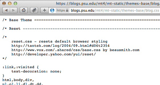
Check each of the downloaded style sheets if you have more than one. If the style sheet has lines at the very top that start with “@import,” you’ll need to change them. If the style sheets don’t have “@imports” at the top (they’ll only be listed first.) or the imports it has point to another stylesheet already in your PASS somewhere, delete your downloaded copy. Those style sheets are already safe. Looking at one with “@import”, copy the url that follows “@import url” to get the address of the style being imported and paste the url into a browser.

The complete text of the c s s file at the web address.

When you load the copied url in a browser, you’ll get the text from that style sheet in your browser window. Click in it and select all. Copy it, then paste into a blank text document. Save it with the same document name as the one you copied.

The first web address now only has the documents name, while the second is highlighted for copying and pasting.

In the downloaded stylesheet, delete the part of the url that goes before your css document name. Now, it will import the stylesheet from the same directory (After we put it there…).

If there are other style sheets imported, do the same thing with them- paste each url in a browser, copy and save the text as a like-named css file, then shorten the “@import” url so the file imported is in the same directory. Save your changes.

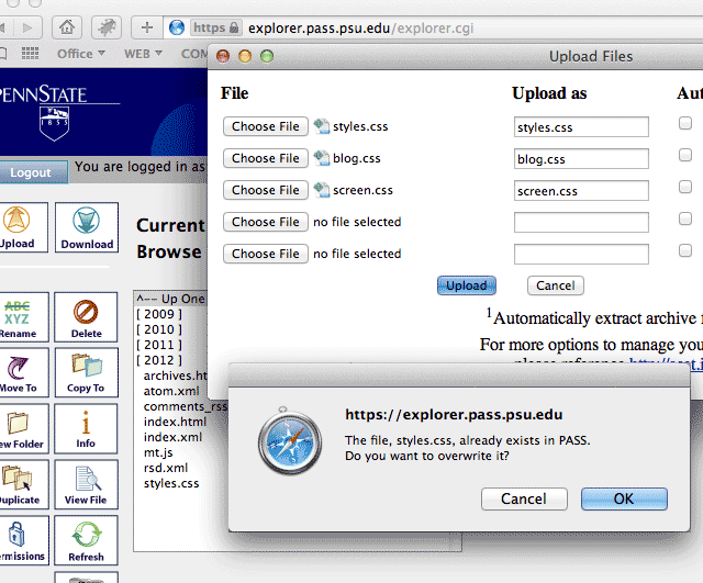
The 'upload Files' window is loaded with the names of all the new and edited css documents and a pop up asks if it's o k to over write the original C S S file that already exists.

Now you’re ready to upload. You can do all of the files – the first css that you corrected as well as each new css that you saved – at the same time. When you click upload, you should get a query asking whether it’s alright to overwrite the old css file in your PASS with the version you just corrected. Click “OK”. That should be it. Your blog now uses files that exist only in your PASS. If for some reason you re-publish a post in this blog, MoveableType will rewrite the stylesheet that you changed. You’ll need to correct it again, but you won’t need to recreate the additional css- they’ll stay in place. Will everything look the same after August 18? Get all of your css inside your PASS and the chances are very good. Is this a guarantee? Heck no; there’s no way to check ahead of time. This is best guessing. I’ll bet on it though.

visual aid

I’m reading the 2008 edition of Clay Christensen’s Disrupting Class. It’s been updated, but this is the version that the library had, and I’m glad for it. I hope the later edition improved the charts. There’s one early on:figure 2.1 in my copy; it sits at the top of the left hand page. It isn’t mentioned till the bottom of the right hand page so by the time I need to look at it, I need to start flipping back to reference the thing. It’s not a stand-alone image. I’d say it’s fairly inexplicable without text, and it’s dense, wiry nature leads me to believe it wasn’t necessarily aimed at visual thinkers.

Christensen references the chart later on. A chart from Clay Christensen's book.In the middle of a paragraph he mentions how the specific real world event being discussed would impact an axis on the chart. That, I imagine, is to clarify it. It was clearer to me without the chart references. Explanation is good, and I can only dream how clear this would be in an audio podcast/interview where Clay didn’t have any charts and was forced to explain things clearly. When I skip the chart references in the book, it’s fantastic. He starts each chapter with a short, well written real world scenario with text set in a contrasting sans font. It works perfectly.

I didn’t start a post just to give an outlier’s blast at Christensen’s excellent book; his charts just reminded me of work that I once had to do. I still don’t get it. A tech group was in the middle of plans focusing on network and hardware changes, authentication, and the impacts across a wide user base. I was brought in because the group had limited experience with graphics applications and thought I’d be able to help with their paper’s appearance. If your ‘visual aid’ needs several pages of explanation, maybe you should get rid of it and simplify your text instead? I was presented with a multi-colored, dense, inexplicable image – one of several they needed help with – and I was given a lengthy description of the chart. Actually, the paper the charts accompanied seemed to be an explanation of the chart rather than an explanation of a set-up, situation or event. I tried to understand, found myself taking up the groups time trying to get clarity when they only seemed to be able to make it worse, and decided to retire to my office to read, absorb and hopefully understand.

At my office I did a search on a few of the keywords that I pulled from the images and sure enough, I found much more of the same. Many of the items returned were pdf files at other universities and all of them had the same multi-colored, obtuse charts accompanying them. So there was precedence for the scientist’s images. They were in their familiar language. If I left them as is, they’d certainly fit in with the oeuvre. I made a few passes at clarification and had positive feedback, but a meeting in another city was far more important at the moment and work was shelved.

A really complex visual 'aid'.The image I’ve shared here is a simplification with, I hope, identifying features removed. I cleaned it up and added consistency of color, layout and iconography among all the separate images so understanding one would at least help in understanding the others. But in the end I failed to clarify to any great extent. This sort of chart—really, any illustration—if it’s to be effective requires complete understanding by the illustrator. The 1000 words that a picture is worth are added one by one with subtlety and nuance as well as flat out artistic design. Anything less and the visuals produced are a hindrance to understanding. If you illustrate, first understand: clear illustration should follow. If textual explanation of the visual aid is necessary, rewrite; consider explaining the idea better instead of explaining the image. Or hire a writer, too.

sweet potato salad

I just ate lunch. Sweet potato salad on a bed of baby spinach leaves. Wonderful.

I boiled the diced sweet potatoes in heavily salted and vinegared water. The vinegar helps to keep fully cooked potatoes firm and it worked on sweet potatoes, too. Acid slows the breakdown of pectin. Anyway, I ran some of the cooked potatoes with some of the cooking water in the blender making a thick purée, then stirred in about the same volume of home made mayonnaise. I usually make my own mayo; changing different vinegars and oils really leads to great flavors and nothing compares. I added two perfectly hard boiled eggs, a few of the small inner stalks from a head of celery, and half a bermuda onion- all nicely diced. Really, really simple. But excellent. Wish I’d have picked up a pinot grigio. I’ll have to make this for someone someday.

And speaking of someone, that granddaughter of mine is getting sprung. On her way home as I type. I wonder if she likes sweet potato salad? It’s pink…