
Walking back into my building this morning I was taken by the flowering bushes along the walk and how the color of their leaves went so well with the color of their blossoms. Actually, I’d noticed it before in wild rose blossoms and day lilies along the highway, but today the match was on my mind. Lovely Sunday morning that it is, it’s comforting to think that mother nature in her infinite wisdom chose matching colors with a clear purpose: The warm green tending towards yellow pairing beautifully with bright, burnt orange blossoms while the cool, soft green 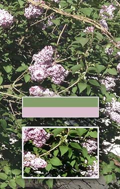 leaves pair beautifully with pink to magenta blossoms. The truth is, sadly, that we just grew up seeing natural pairings and have developed our sense of beauty based on what we see. Color wheels, those wonderful tools used to help designers make choices, don’t exist naturally. Color wheels are an invention to help us codify the way we see, not a scheme that nature follows.
One of the great art books that I inherited from my dad is a large hardcover filled with beautiful illustrations: Goethe’s Color Theory. In it, Goethe presents a vast collection of color wheels he developed, all attempting to codify our choices in a scientific fashion. One of the most surprising to me as a child was one with magenta as a primary and red as a secondary. Red can be made from magenta with yellow. That blew away all of the Roy G Biv nonsense I’d learned, but it matches our printing primaries perfectly: Cyan, Magenta, and Yellow of CMYK fame. I was already a bit annoyed with that “indigo” addition. Indigo? Really?
So back to our flowers. We grew up seeing flowers on plants. Our sense of beauty comes very much from seeing those flowers as well as a dark, unsaturated lawn against a dark gray sky or a bright, saturated green lawn against a bright blue sky. We’ve been trained to respond to color choices based on how we may have felt about the combinations in nature. Beauty, and what we think are appropriate color pairings, are human constructs to help us determine value.
Which brings me to why I chose to mention this now. I read that Bon Appétit shot it’s May cover with an iPhone. I haven’t seen the cover yet, only an online version. The versions I’ve seen look a bit soft focused. I wonder if the Art Director for Bon Appétit’s May ’75 cover would accept the iPhone shot? Though I readily accept the advances in phone technology I wonder if our sense of what’s useful, valuable, beautiful, isn’t changing based on society’s changing view? To be clear, that isn’t a value judgment. What I value, what I think is beautiful, mostly belongs to another time.
Well. I just realized I wrote about this nine years ago in my old ‘davidstong’ blog.